Lockup
The default. App headers, navs, product chrome, anywhere the company signs its name.
Never below 96px wide
ebenworks-lockup.svgEverything that carries the Ebenworks name comes from here — the site, nine products, the documents, the mail. One rule does most of the work: the full lockup is the mark, not the bare EW.
Four variants, one job each. Pick by the space you have, not by taste — and never redraw, recolour, stretch, rotate or outline any of them.
The default. App headers, navs, product chrome, anywhere the company signs its name.
Never below 96px wide
ebenworks-lockup.svg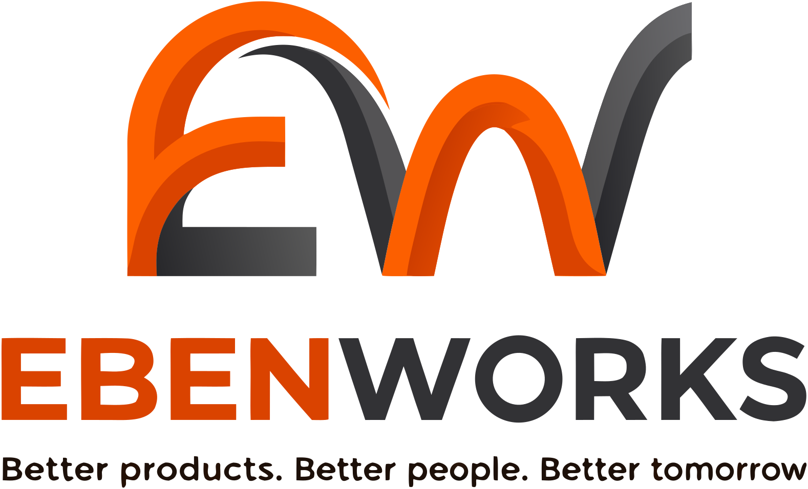
The lockup with the tagline. Hero moments, formal documents, first impressions.
Never below 240px wide — under that the tagline stops being legible
ebenworks-primary.svg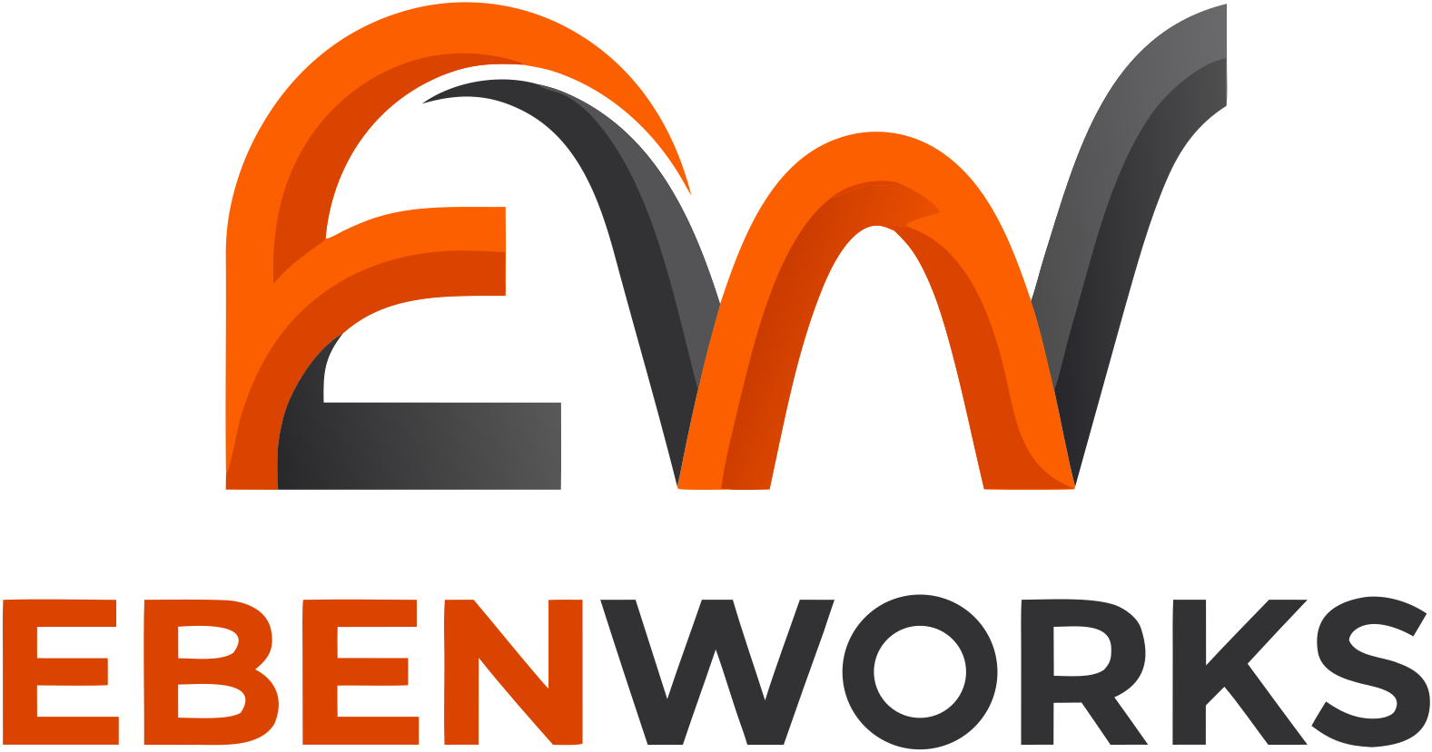
Square-ish spaces: slides, signatures, anywhere the horizontal lockup is too wide.
Never below 96px wide
ebenworks-stacked.svg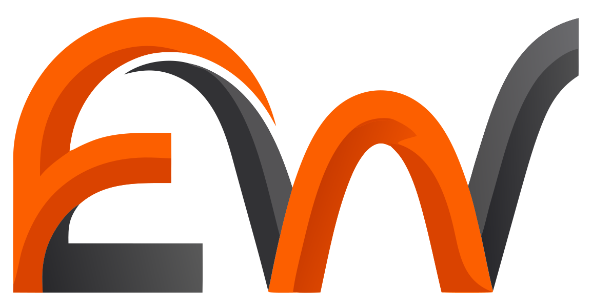
Tight spaces only — favicons, app icons, avatars, watermarks, the company seal.
Never below 24px, and never beside a typeset “Ebenworks”
ebenworks-mark.svgKeep a margin of a quarter of the mark’s height on every side. Nothing lives inside it — no text, no other marks, no edges.
Use the -on-dark artwork, which carries a light wordmark. Do not recolour the light version or drop a filter over it.
The wordmark is part of the artwork. Never set “Ebenworks” as text beside it — that renders the name twice.
One orange, one ink, and air. Orange is reserved to Ebenworks itself — no product may take it, or anything close enough to be mistaken for it.
#FC5F00The brand. Accents, CTAs, one gesture per view.
#DA4300Pressed and hover states.
#B23700Orange that passes AA as body text.
#1D1009Text.
#28282BDark UI, the wordmark's dark half.
#FAF8F4The default ground.
Orange 500 on paper passes AA for large text only. For body copy and links use Orange 700. Brand colour on a button or a link has to pass 4.5:1.
Light and dark values ship as paired design tokens. tokens.css, tokens.json, theme.ts, tailwind.config.js.
A product’s accent comes from that product, never invented centrally — which is what makes nine siblings tellable apart.
Each product keeps its own mark — the one it ships on its own site and in its own app. What they share is the container: a 512 px tile, inset 32, radius 112, on the product’s own ground. Nine real logos, one family. The tile is opaque, so there is no reversed variant — one file works on any background.



Geist everywhere. Bricolage Grotesque for brand moments only — posters, decks, campaign headlines. Never product UI.
Better Products. Better People. Better Tomorrow.
Geist, the working face: plain, concrete English set the way the engineer who did the work would write it.
Geist Mono — code, metadata, labels, numbers.
Three devices, three different claims. They are not interchangeable.
Products Ebenworks builds and owns. The stamp is the label plus the lockup — no other wordmark.
Built with Statotech Systems. Both marks, each brand named exactly once, the caption carrying no company name at all.
Third-party surfaces Ebenworks sponsors but did not build. Never used on our own products.
The kit is a directory, not a PDF. Every link below is a real file — a folder path would 404 on the apex and, on this host, quietly serve this page back instead of a download.
Questions, or something here is wrong? contact@ebenworks.co